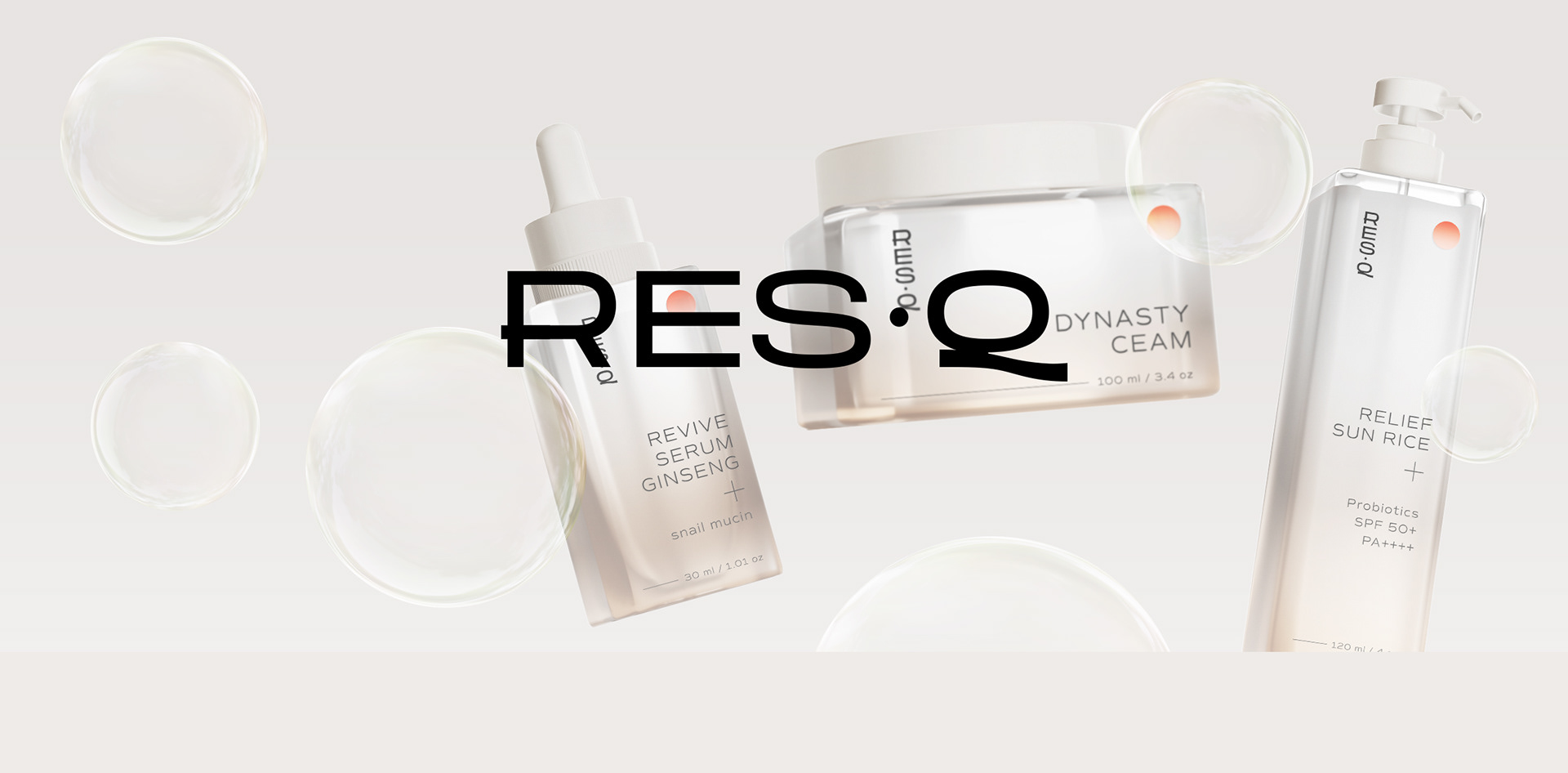
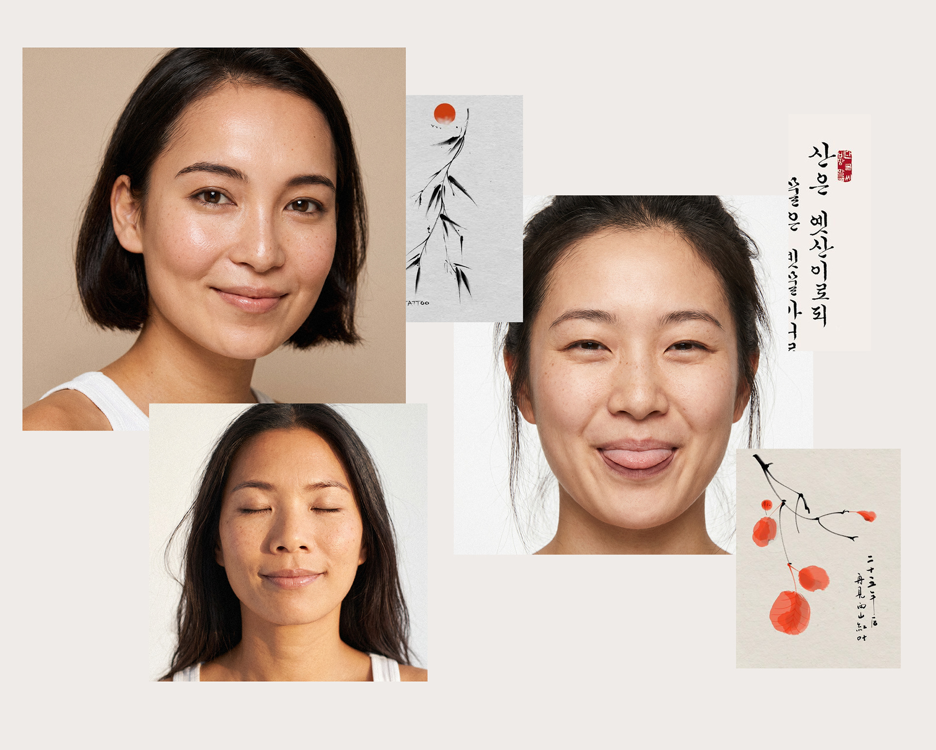
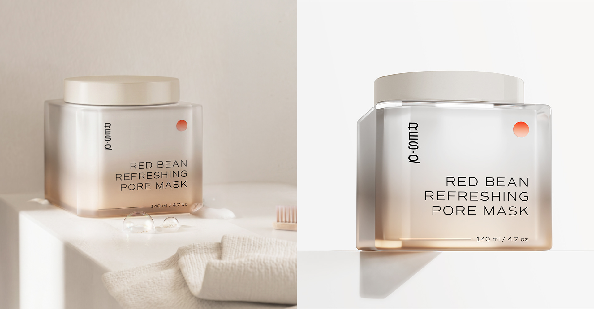
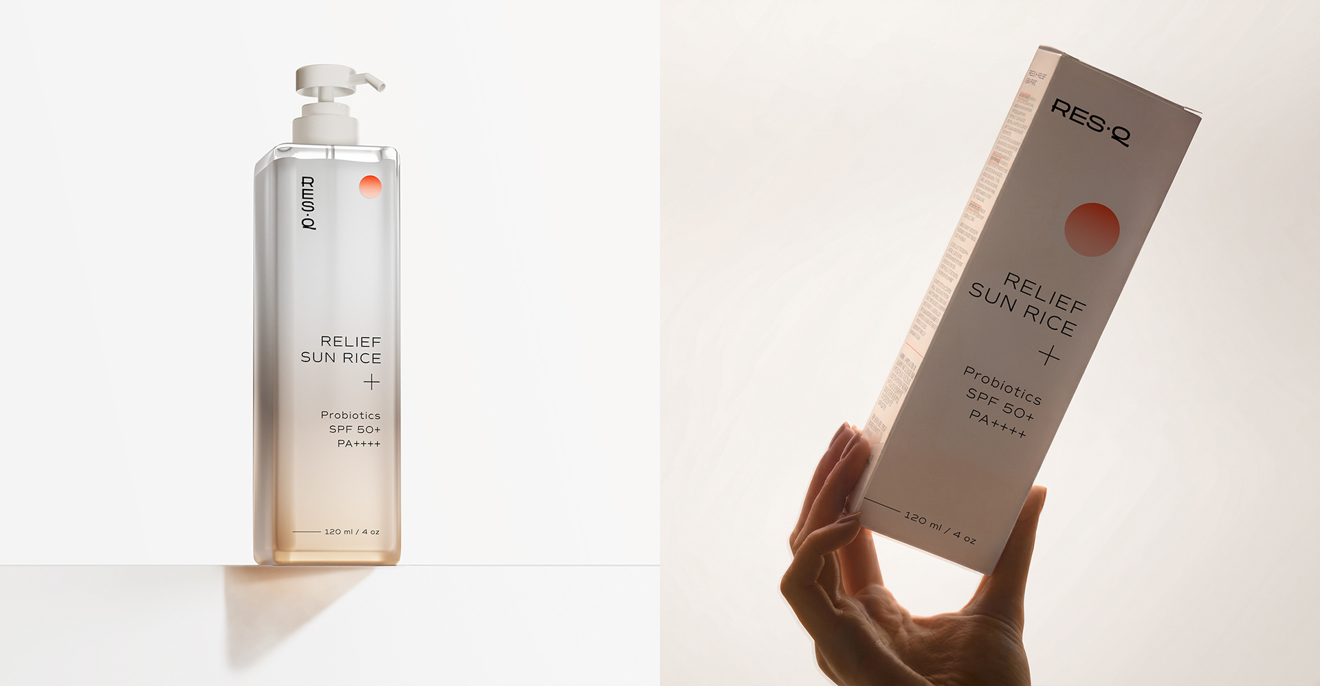
We revamped the packaging and branding for a Korean skincare line, giving it a modern twist while staying true to its cultural roots.
Adding a bit of tech magic*, we based all our communication and ads on 3D** and AI.
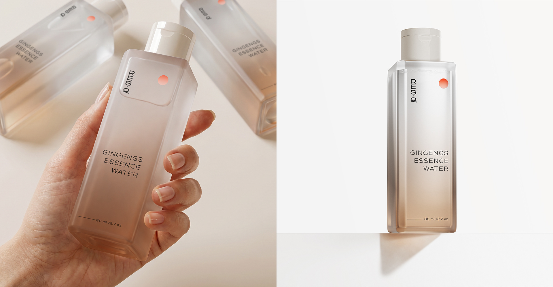
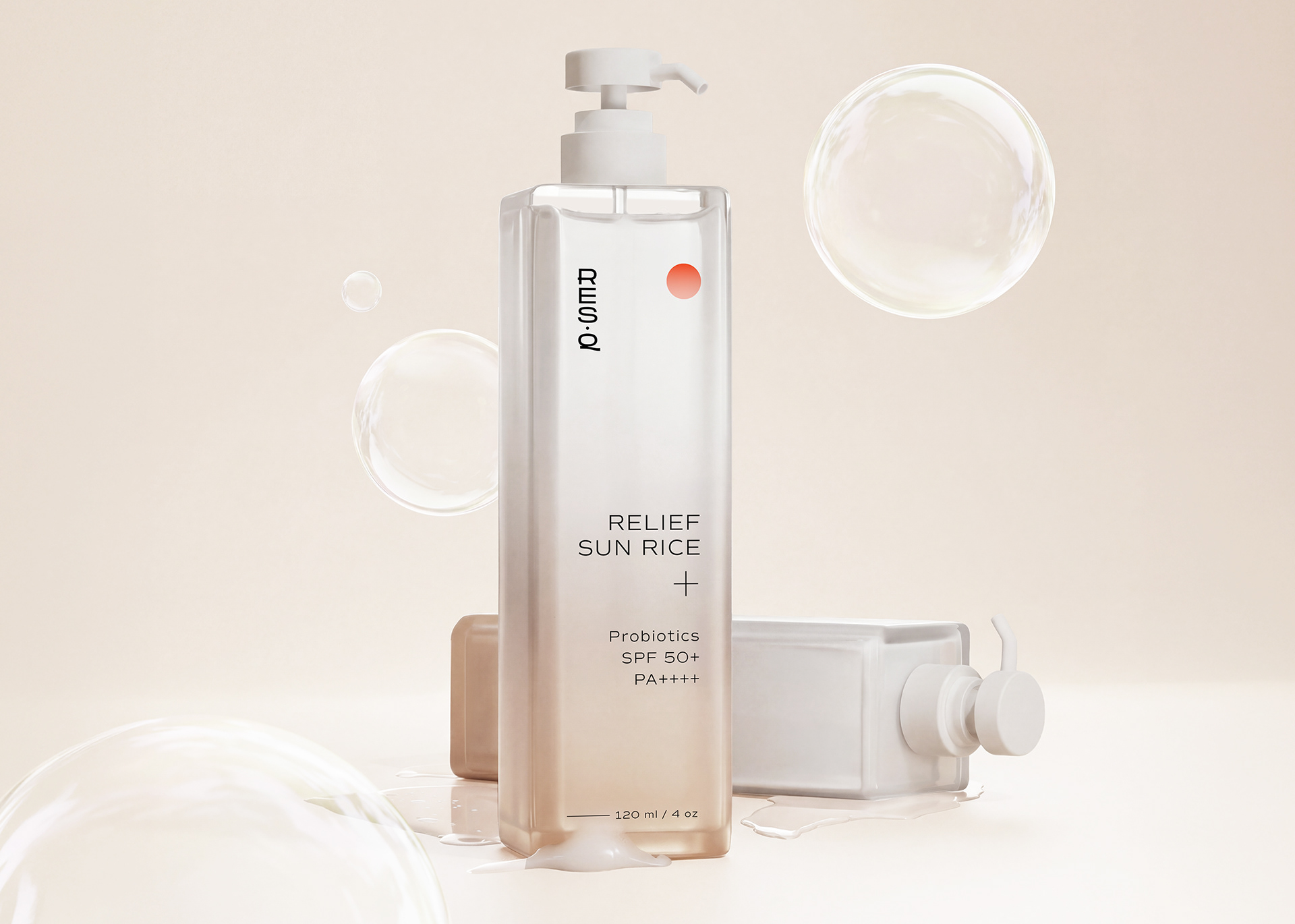
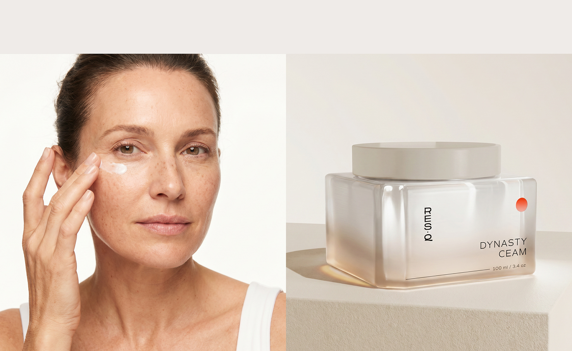
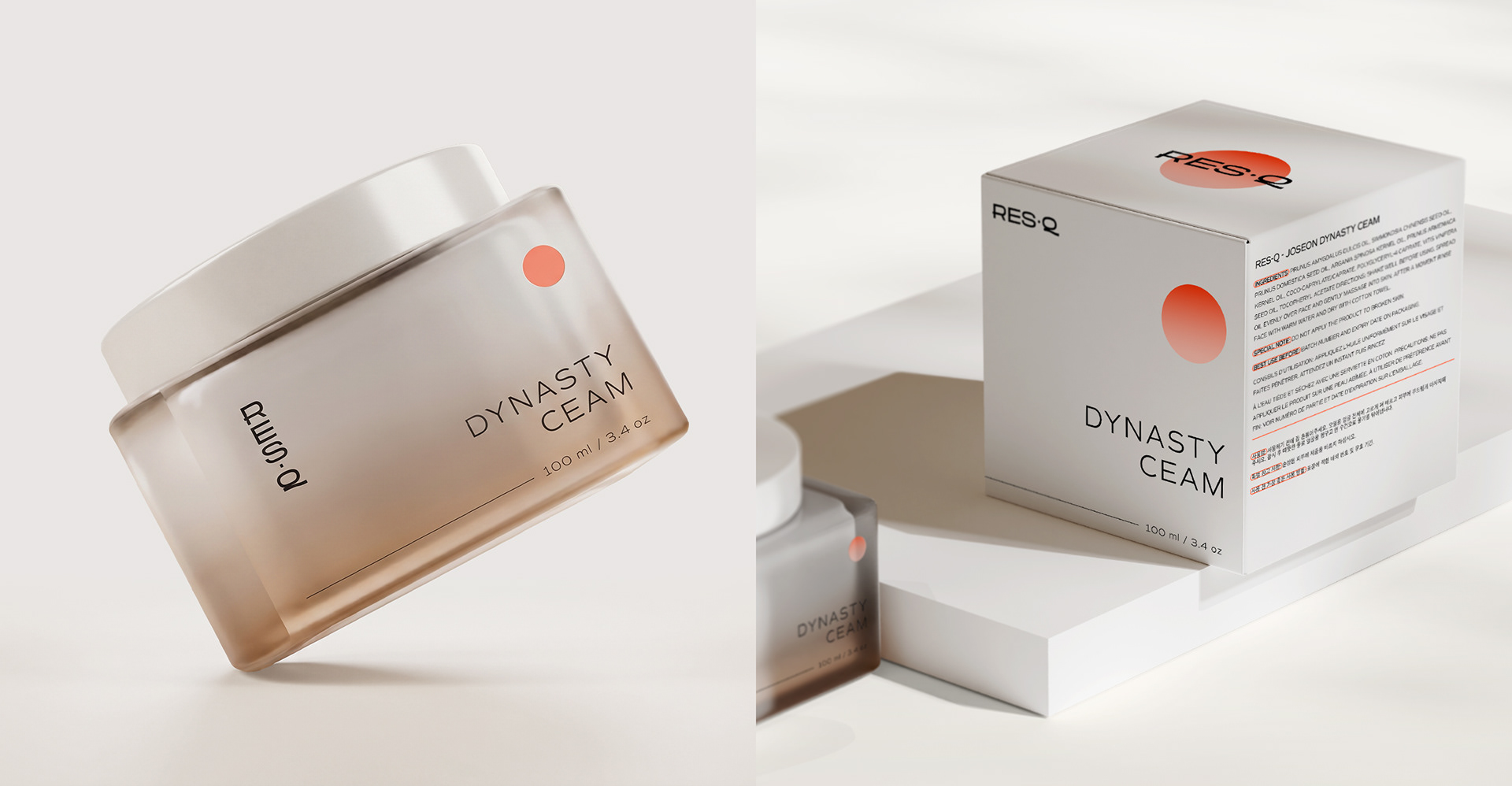
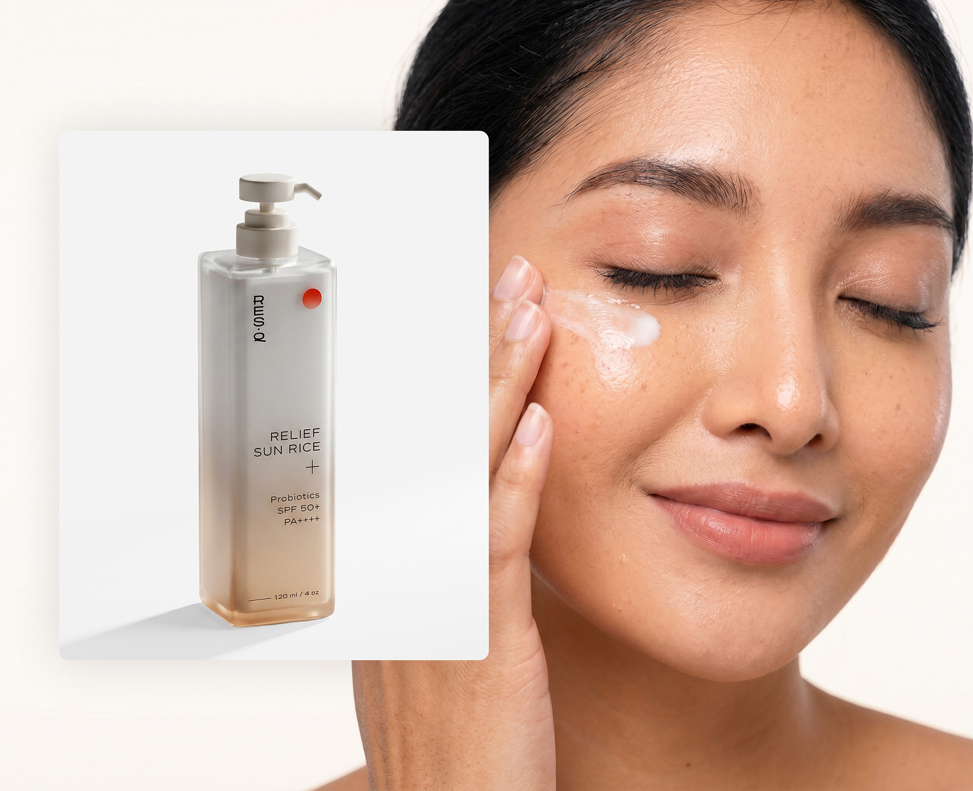
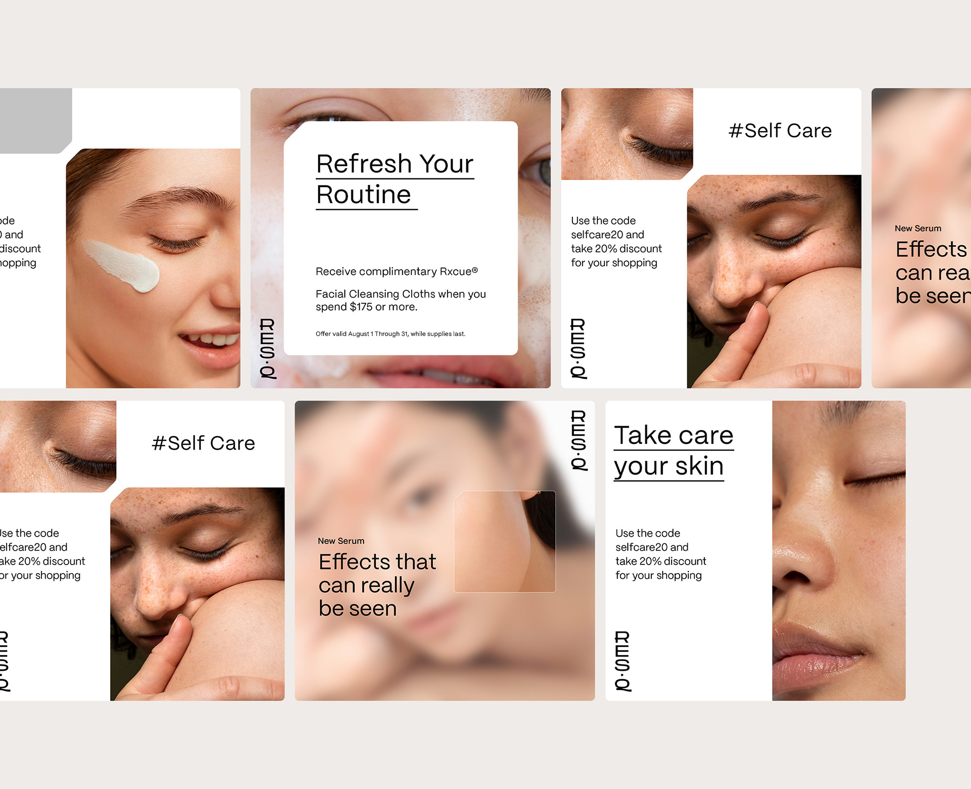
Our unique approach led to eye-catching product and lifestyle shots, ideal for social media and websites.
*The product photography was created entirely in 3D with post-production in Photoshop. And some of the image photos, the faces of models in Midjourney.
Our unique approach led to eye-catching product and lifestyle shots, ideal for social media and websites.
*The product photography was created entirely in 3D with post-production in Photoshop. And some of the image photos, the faces of models in Midjourney.
It's surprising how strategic planning and the right team can bringthat big project to life without ever leaving home.
우리는 한국 스킨케어 라인의 패키지와 브랜딩을 현대적으로 재해석하면서도 문화적 뿌리를 충실히 반영했습니다.
약간의 기술 마법*을 더해, 모든 커뮤니케이션과 광고를 3D**와 AI 기반으로 제작했습니다.
우리만의 독창적인 접근 방식으로 시선을 사로잡는 제품 및 라이프스타일 이미지를 만들어냈으며, 이는 소셜 미디어와 웹사이트에 완벽하게 어울립니다.
*제품 사진은 3D로 완전히 제작되었으며, 후반 작업은 Photoshop에서 이루어졌습니다. 일부 이미지 사진에서는 Midjourney를 통해 모델의 얼굴을 생성했습니다.
전략적인 기획과 올바른 팀만 있다면, 집을 한 발짝도 나가지 않고도 이렇게 큰 프로젝트를 실현할 수 있다는 점이 놀랍습니다.
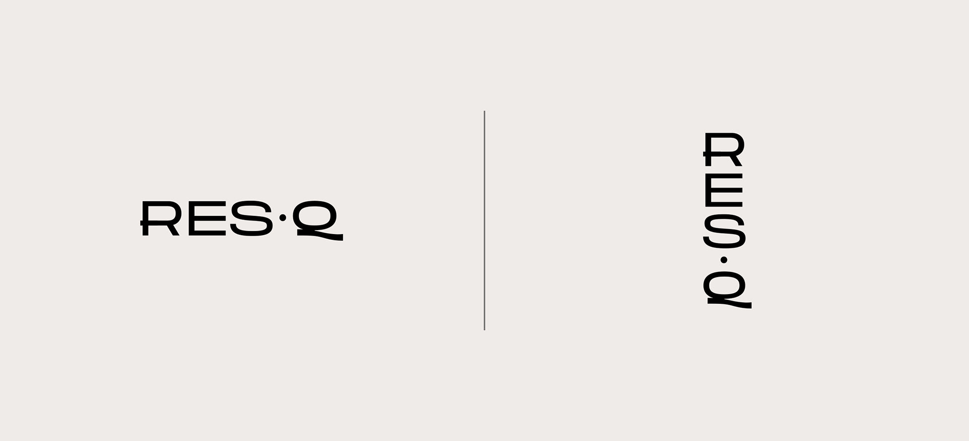
The main intention and intriguing feature of the logo was to design letters with a width and balance that would appear aesthetically pleasing in both vertical and horizontal orientations. We incorporated two of these letters into our materials, aiming to express the traditions of both European and Asian writing systems.
로고의 주요 의도와 흥미로운 특징은 수직과 수평 방향 모두에서 미적으로 보기 좋은 폭과 균형을 가진 글자를 디자인하는 것이었습니다. 우리는 이러한 글자 중 두 개를 우리의 자료에 포함시켜 유럽과 아시아의 문자 체계 전통을 표현하고자 했습니다.
로고의 주요 의도와 흥미로운 특징은 수직과 수평 방향 모두에서 미적으로 보기 좋은 폭과 균형을 가진 글자를 디자인하는 것이었습니다. 우리는 이러한 글자 중 두 개를 우리의 자료에 포함시켜 유럽과 아시아의 문자 체계 전통을 표현하고자 했습니다.
**3D renderings were made by Igor Herynowski, post-production and artistic direction by the creator of the project Bartosz Peters
렌더링은 Igor Herynowski가 제작했으며, 후반 작업 및 아트 디렉션은 프로젝트 창작자인 Bartosz Peters가 담당했습니다.