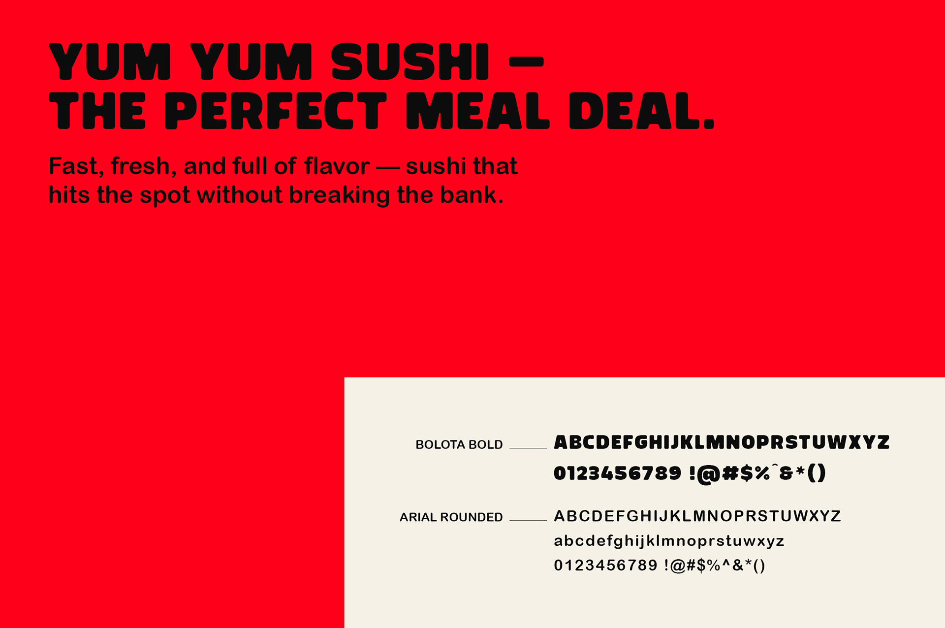
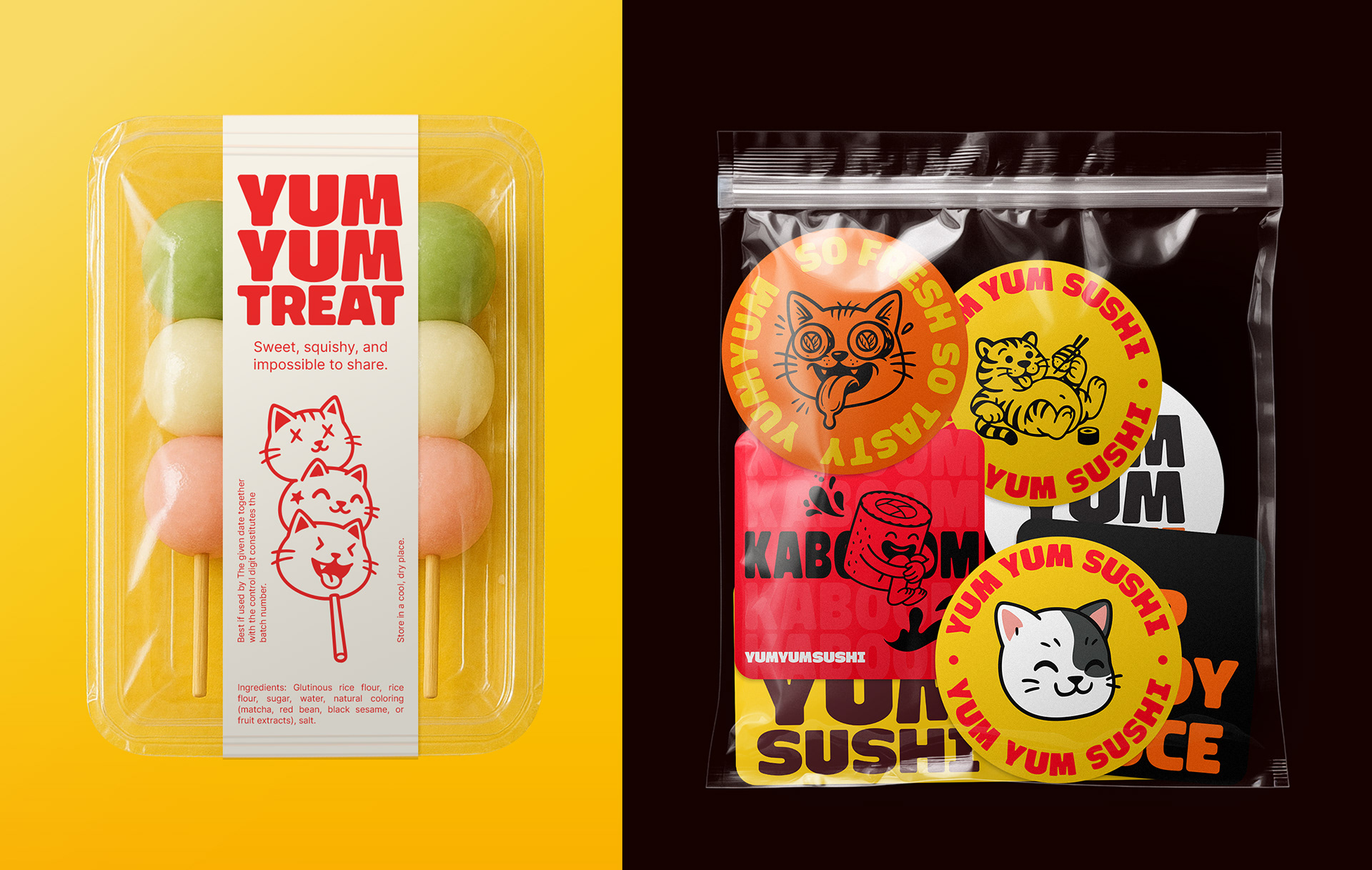
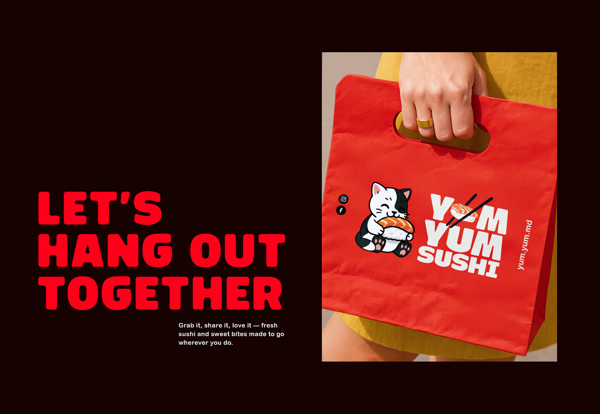
Let’s break the stigma of sushi being only for posh and expensive, candle-light dinners! Our client came up to us with a sweet idea for a sushi take-away restaurant targeted towards young people who wish to experience the taste of fresh sushi without braking the bank. Since the restaurant doesn’t offer dine-in, every printed touchpoint - from the bags to the packaging - carries extra weight. It’s the first real handshake between the brand and its customer.
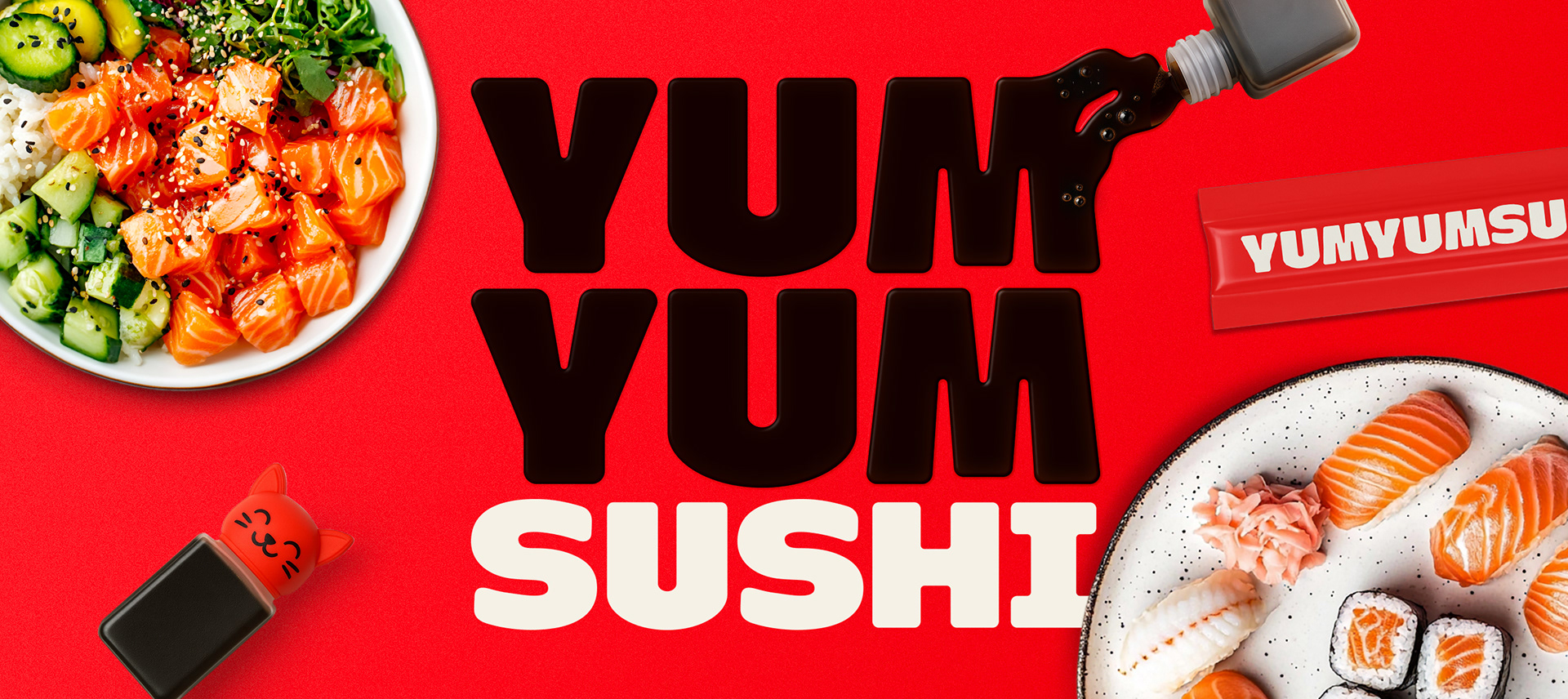
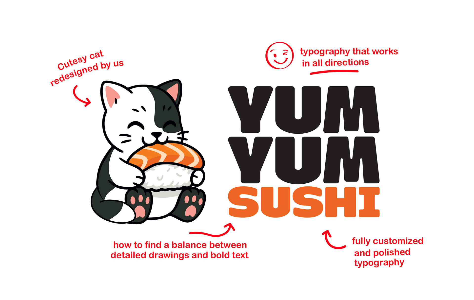
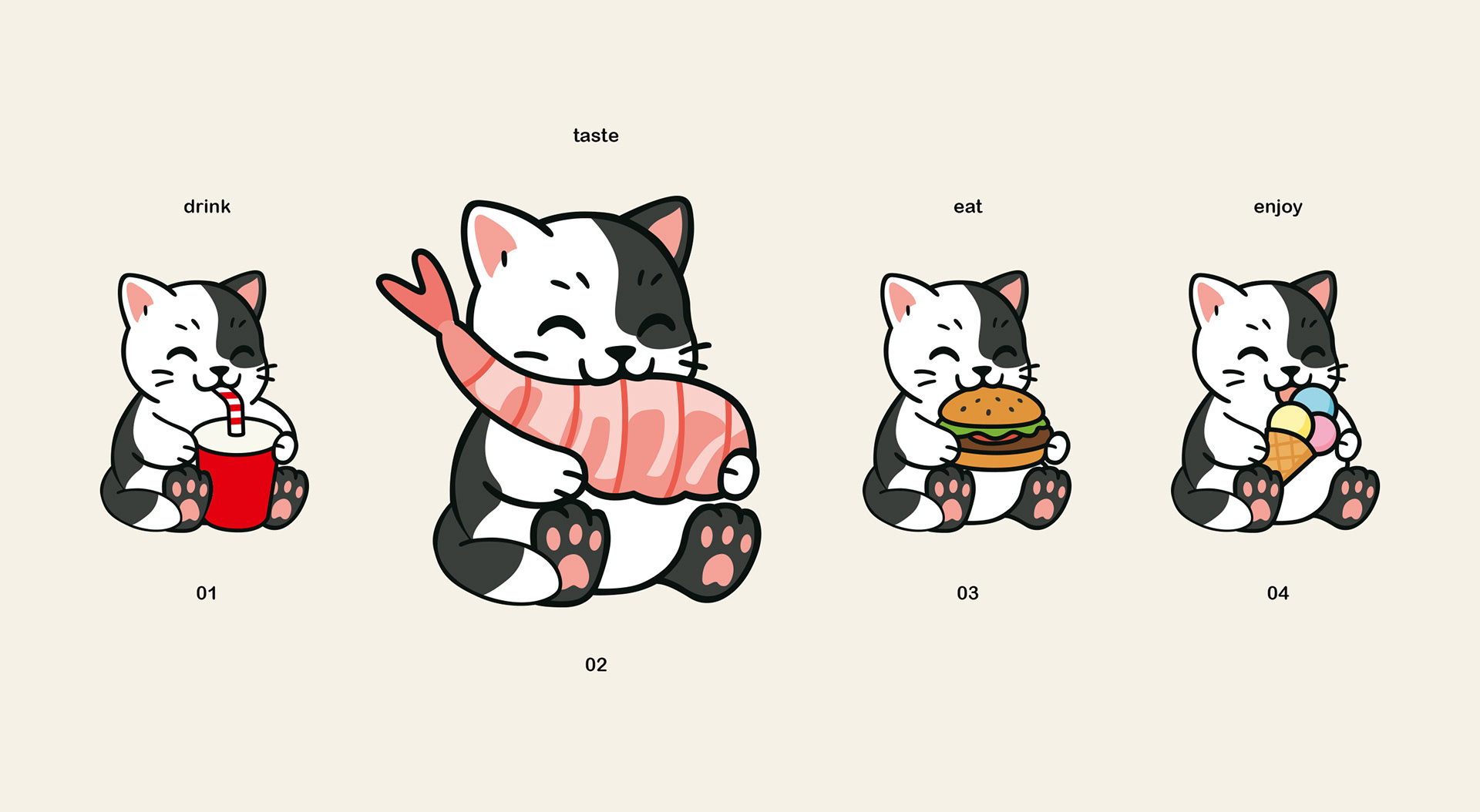
Our goal? A bold tone of voice, mouth-watering typography, and playful illustrations that echo the rhythm of “yum” in the brand’s name. We made sure the logo works seamlessly in every setup - horizontal, vertical, single-line, or compact for.
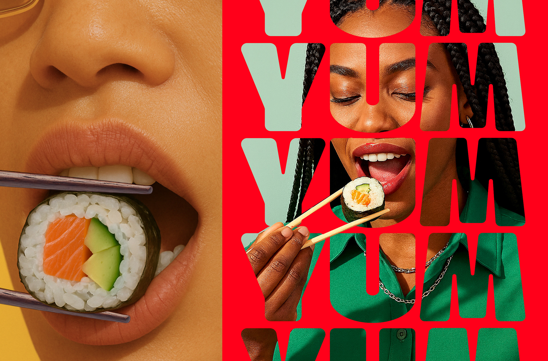
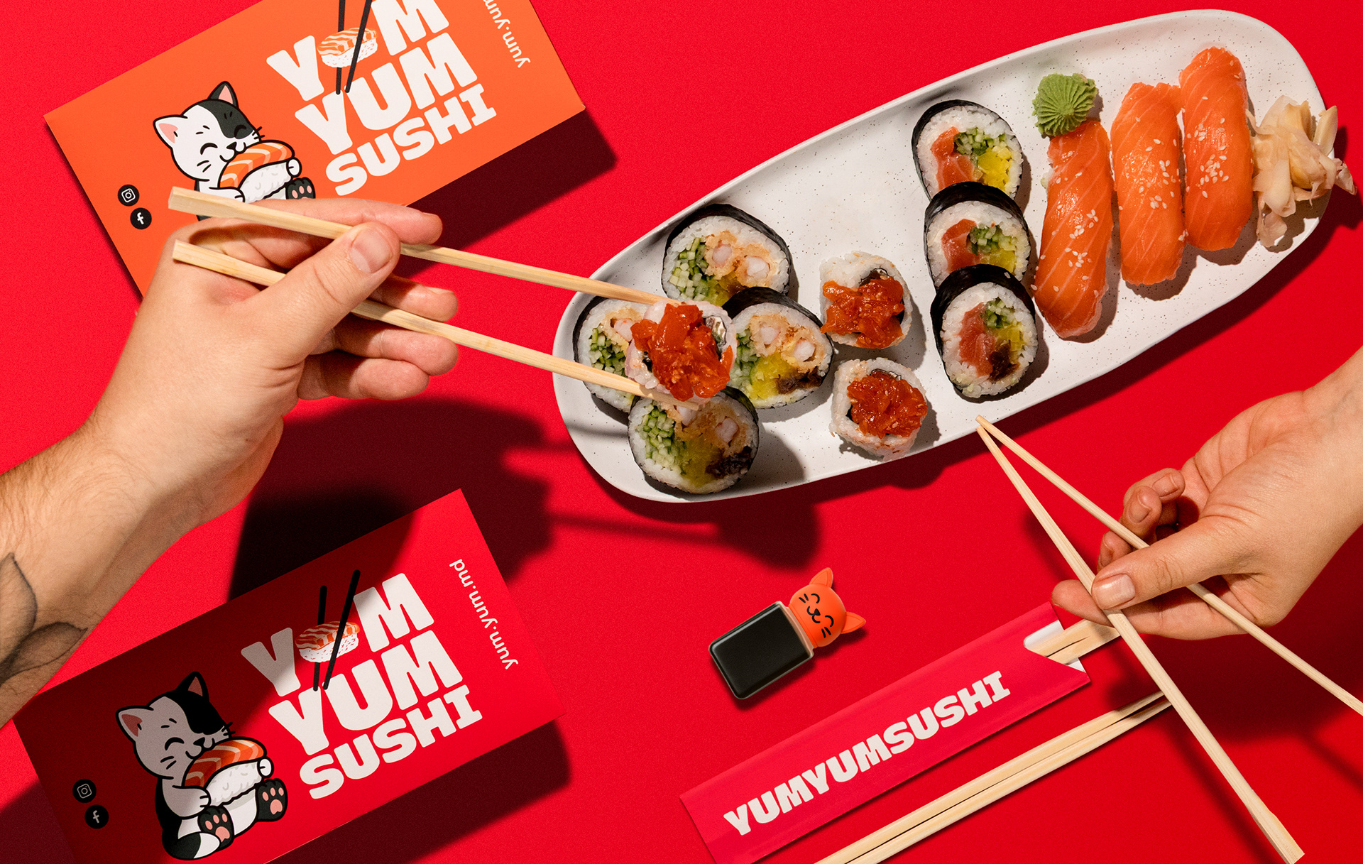
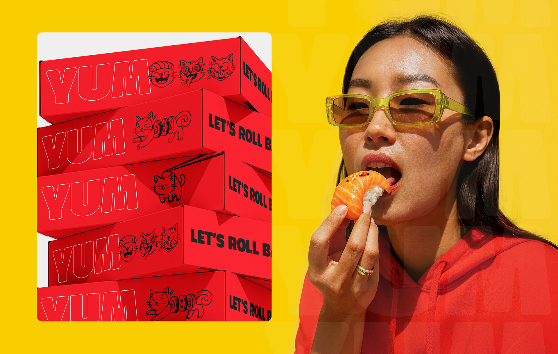
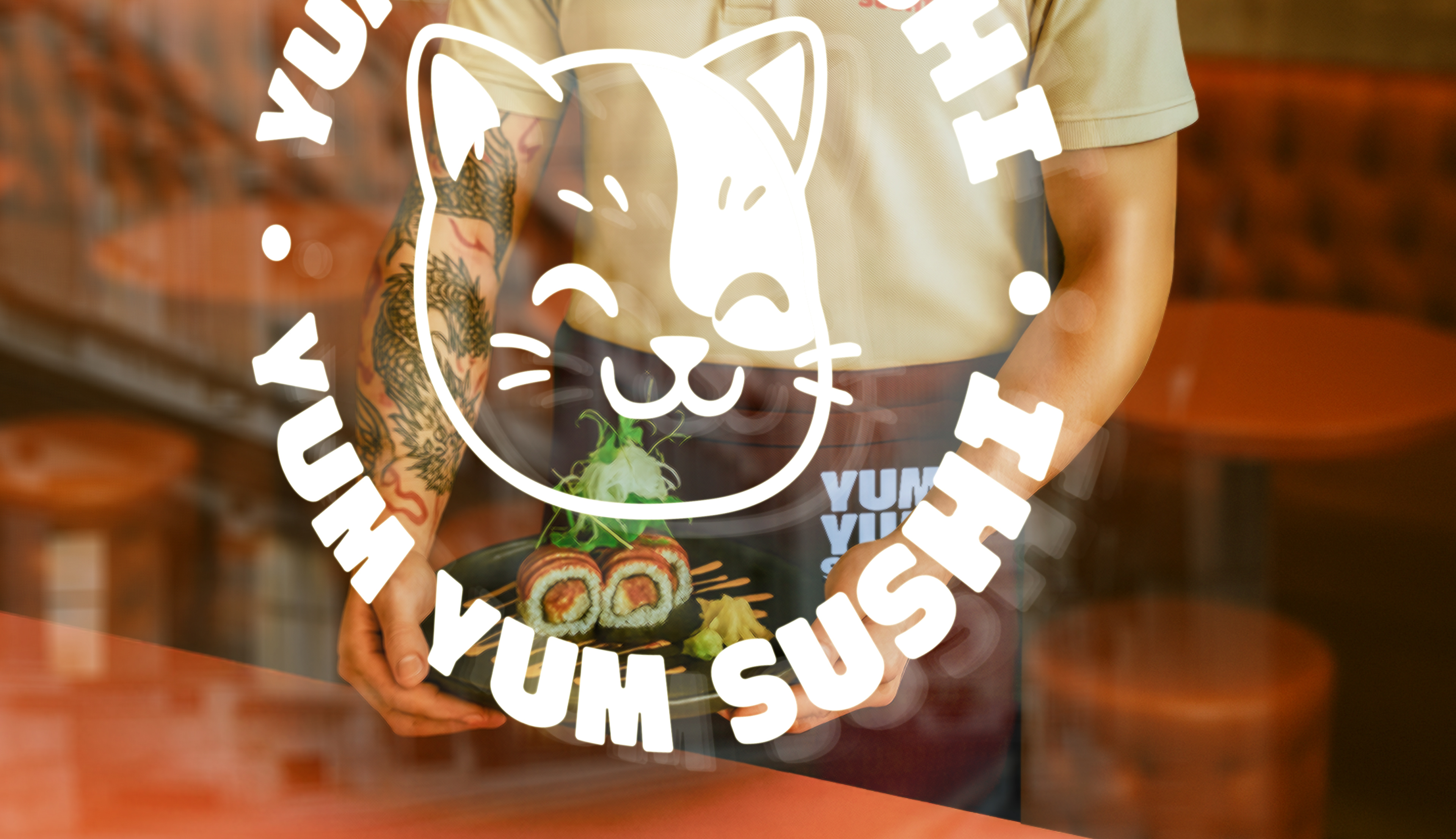
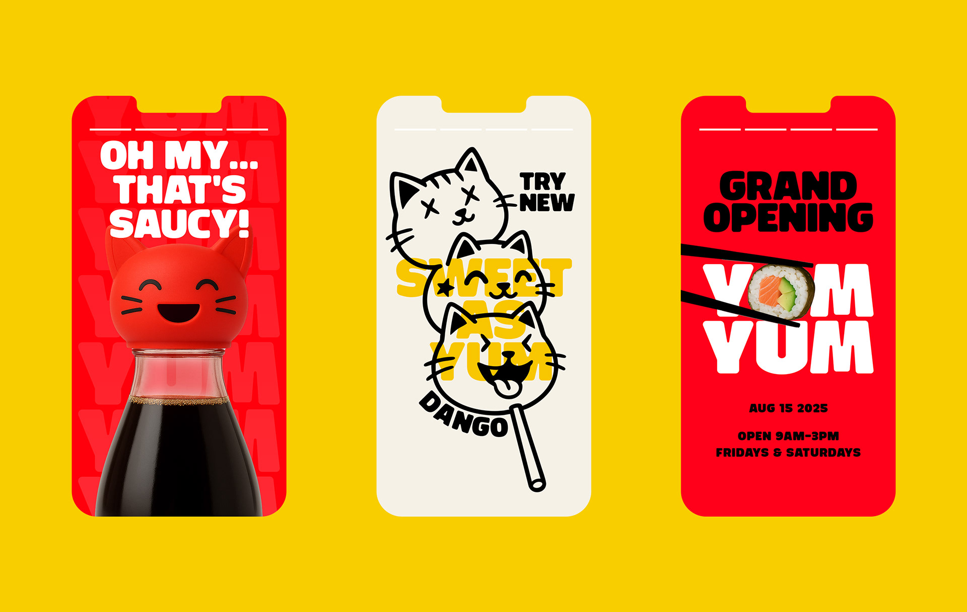
PHOTOGRAPHY | Product & Lifestyle